Search-powered locators allow users to find store locations based on search criteria. A store locator is an amazing way to visually direct website visitors to relevant business locations.
By combining Yext Search with a front-end map component, it is easy to deliver high-quality search results in an interactive and appealing map format.
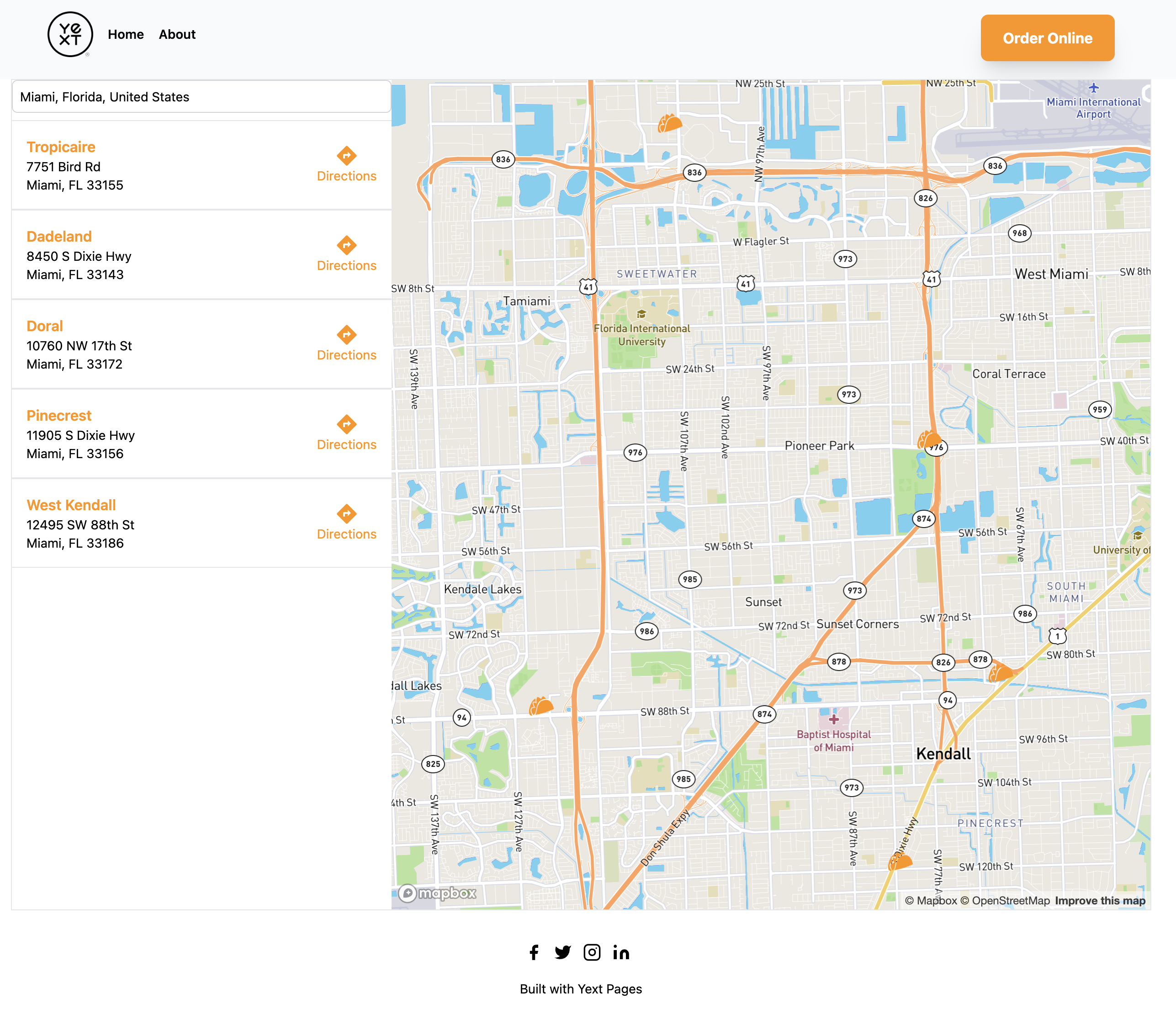
Note that locators can be built using any Maps provider. The steps below go through building a locator with MapBox because there is a built-in Search component for it.
Prerequisites: This guide assumes you have a working version of a Pages project based off of pages-starter-react-locations. If you need to set that up, run yext pages new and choose "Locations Starter (Basic)". Be sure to populate your Knowledge Graph with seed data when prompted.
Step 1: Configure Search in Your Yext Account
Only a few steps are required to build a simple Search experience:
- From within your Yext account, click Search in the navigation bar and then click All Search Experiences.
- Add a Search experience. If you already have a search experience, you will see a button in the top right to Add Experience. If you do not have any experiences, you will be prompted to Create Search Experience.
- Under Experience Name, enter "Turtlehead Tacos Locator". The Experience ID will be automatically generated and can be left untouched. Then, click Save.
- You will then be brought to the Home screen for your new experience. In the left sidebar, click Verticals (under the Configuration section).
- Click Add Vertical and select the entity types to include in your search experience. For a locations-only locator, leave all other entity types unchecked.
- Click Add Vertical. Then, click Save at the bottom of the screen.
- Once your search is created, in the left sidebar of your newly created experience, click Edit as JSON and add
builtin.locationas a static filter to the searchable fields in the Locations vertical:
"verticals": {
  "locations": {
    "entityTypes": [
      "location"
    ],
    "name": "Locations",
    "searchableFields": {
      "builtin.location": {
        "staticFilter": true
      }
    },
    "sortBys": [],
    "source": "YEXT"
  }
}
Most store locators use filter search instead of a natural language search bar. Filter search allows users to search by location (city, region, etc.) rather than free text.
Step 2: Install Search UI React and Add Styling
In the terminal, add the Search UI React library to your application:
npm i @yext/search-ui-react @yext/search-headless-react
The Search UI components require a bit of extra styling configuration. Open tailwind.config.ts and make sure your file looks like the following:
// tailwind.config.ts

import type { Config } from "tailwindcss";
import { ComponentsContentPath } from "@yext/search-ui-react";

export default {
  content: [
    "./src/**/*.{html,js,jsx,ts,tsx}",
    ComponentsContentPath
  ],
  theme: {
    extend: {
      colors: {
        orange: "#ff9500",
        "dark-orange": "#db8000",
      },
      scale: {
        1.02: "1.02",
      },
    },
  },
  plugins: [],
} satisfies Config;
Step 3: Add a Locator Template
You need a new static template where you will add your store locator component. In src/templates, add a new file called locator.tsx and paste the following code:
Note: Add your search API Key to a
.envfile and call itYEXT_PUBLIC_SEARCH_API_KEY. You can find this by navigating to Search > Turtlehead Tacos Locator > General Settings within the platform. All environment variables in Yext Pages must be prefixed withYEXT_PUBLIC.
// src/templates/locator.tsx

import "../index.css";
import {
  GetHeadConfig,
  GetPath,
  Template,
  TemplateProps,
  TemplateRenderProps,
} from "@yext/pages";
import PageLayout from "../components/PageLayout";
import {
  provideHeadless,
  Environment,
  SearchHeadlessProvider,
} from "@yext/search-headless-react";
import { FilterSearch } from "@yext/search-ui-react";

export const getPath: GetPath<TemplateProps> = () => {
  return `locator`;
};

export const getHeadConfig: GetHeadConfig<TemplateRenderProps> = () => {
  return {
    title: "Turtlehead Tacos Locations",
    charset: "UTF-8",
    viewport: "width=device-width, initial-scale=1",
  };
};

const searcher = provideHeadless({
  apiKey: YEXT_PUBLIC_SEARCH_API_KEY,
  // make sure your experience key matches what you see in the platform
  experienceKey: "turtlehead-tacos-locator",
  locale: "en",
  environment: Environment.SANDBOX,
  verticalKey: "locations",
});

const Locator: Template<TemplateRenderProps> = ({ __meta, document }) => {
  return (
    <PageLayout templateData={{ __meta, document }}>
      <SearchHeadlessProvider searcher={searcher}>
        <div className="mx-auto max-w-7xl px-4">
          <FilterSearch
            placeholder="Find Locations Near You"
            searchFields={[
              {
                entityType: "location",
                fieldApiName: "builtin.location",
              },
            ]}
          />
        </div>
      </SearchHeadlessProvider>
    </PageLayout>
  );
};

export default Locator;
Key points about this template:
-
provideHeadlessinstantiates a newSearchHeadlessinstance for your project. Passing this as thesearcherprop toSearchHeadlessProviderensures that any child components of the provider have access to the Search state. - Since this uses a Sandbox account, the
Environment.SANDBOXvalue is passed toprovideHeadless. If you are building a locator for a Production account, removeenvironment: Environment.SANDBOXfrom the configuration. - By providing
'locations'as theverticalKey, all vertical query requests will be made on the Locations vertical.
Run npm run dev in the terminal and go to the locator page to test that everything is working properly.
Step 4: Create a Store Locator Component
Generate a Mapbox API Token
The map for your locator is going to be powered by the MapboxMap component from Search UI React. In order to use the Mapbox APIs, sign up for a Mapbox account and get an API key.
Copy the token you generated and add it to .env:
YEXT_PUBLIC_MAPBOX_API_KEY=YOUR_MAPBOX_API_KEY
Create the StoreLocator Component
In src/components, add a new file called StoreLocator.tsx and paste the following code:
// src/components/StoreLocator.tsx

import {
  MapboxMap,
  FilterSearch,
  OnSelectParams,
  VerticalResults,
  StandardCard,
} from "@yext/search-ui-react";
import {
  Matcher,
  SelectableStaticFilter,
  useSearchActions,
} from "@yext/search-headless-react";
// Mapbox CSS bundle
import "mapbox-gl/dist/mapbox-gl.css";

const StoreLocator = (): JSX.Element => {
  const searchActions = useSearchActions();

  const handleFilterSelect = (params: OnSelectParams) => {
    const locationFilter: SelectableStaticFilter = {
      selected: true,
      filter: {
        kind: "fieldValue",
        fieldId: params.newFilter.fieldId,
        value: params.newFilter.value,
        matcher: Matcher.Equals,
      },
    };
    searchActions.setStaticFilters([locationFilter]);
    searchActions.executeVerticalQuery();
  };

  return (
    <>
      <div className="flex h-[calc(100vh-242px)] border">
        <div className="flex w-1/3 flex-col">
          <FilterSearch
            onSelect={handleFilterSelect}
            placeholder="Find Locations Near You"
            searchFields={[
              {
                entityType: "location",
                fieldApiName: "builtin.location",
              },
            ]}
          />
          <VerticalResults
            customCssClasses={{ verticalResultsContainer: "overflow-y-auto" }}
            CardComponent={StandardCard}
          />
        </div>
        <div className="w-2/3">
          <MapboxMap
            mapboxAccessToken={YEXT_PUBLIC_MAPBOX_API_KEY || ""}
          />
        </div>
      </div>
    </>
  );
};

export default StoreLocator;
Key points about StoreLocator:
- The
MapboxMapcomponent needs to be placed within a container that has a set height. The outerdivusesh-[calc(100vh-242px)]to set the height equal to the screen minus the header and footer. -
FilterSearchandVerticalResultsare placed to the left of the map. When a user selects a location from the dropdown,handleFilterSelectruns a search for nearby locations.
Add StoreLocator to the Locator Template
Import StoreLocator into locator.tsx and replace the temporary FilterSearch with your new component:
// src/templates/locator.tsx

import "../index.css";
import {
  GetHeadConfig,
  GetPath,
  Template,
  TemplateProps,
  TemplateRenderProps,
} from "@yext/pages";
import PageLayout from "../components/PageLayout";
import StoreLocator from "../components/StoreLocator";
import {
  provideHeadless,
  SearchHeadlessProvider,
} from "@yext/search-headless-react";

export const getPath: GetPath<TemplateProps> = () => {
  return `locator`;
};

export const getHeadConfig: GetHeadConfig<TemplateRenderProps> = () => {
  return {
    title: "Turtlehead Tacos Locations",
    charset: "UTF-8",
    viewport: "width=device-width, initial-scale=1",
  };
};

const searcher = provideHeadless({
  apiKey: YEXT_PUBLIC_SEARCH_API_KEY,
  experienceKey: "turtlehead-tacos-locator",
  locale: "en",
  verticalKey: "locations",
});

const Locator: Template<TemplateRenderProps> = () => {
  return (
    <PageLayout>
      <SearchHeadlessProvider searcher={searcher}>
        <div className="mx-auto max-w-7xl px-4">
          <StoreLocator />
        </div>
      </SearchHeadlessProvider>
    </PageLayout>
  );
};

export default Locator;
Run npm run dev and go to the locator page. You should see the map to the right of the search bar and results container.
Step 5: Add Custom Location Result Cards
Generate TypeScript Types for Your Search Experience
The Yext CLI can generate TypeScript types for a particular search experience. In the terminal, run:
yext types generate search src/types --experienceKey turtlehead-tacos-locator
Check out the new locations.ts file generated inside src/types. The Location type contains all possible fields that could be included in a Location search result.
Also install React Icons, which you will use for custom styling:
npm i react-icons
Create a Custom Location Result Card
Create a new file called LocationCard.tsx in src/components:
// src/components/LocationCard.tsx

import { CardComponent, CardProps } from "@yext/search-ui-react";
import Location, { Coordinate } from "../types/locations";
import { RiDirectionFill } from "react-icons/ri";

const LocationCard: CardComponent<Location> = ({
  result,
}: CardProps<Location>): JSX.Element => {
  const location = result.rawData;

  // function that takes coordinates and returns a google maps link for directions
  const getGoogleMapsLink = (coordinate: Coordinate): string => {
    return `https://www.google.com/maps/dir/?api=1&destination=${coordinate.latitude},${coordinate.longitude}`;
  };

  return (
    <div className="flex justify-between border-y p-4">
      <div className="flex">
        <div>
          <a
            target={"_blank"}
            href={location.slug}
            className="font-semibold text-orange"
            rel="noreferrer"
          >
            {location.neighborhood}
          </a>
          <p className="text-sm">{location.address.line1}</p>
          <p className="text-sm">{`${location.address.city}, ${location.address.region} ${location.address.postalCode}`}</p>
        </div>
      </div>
      <div className="flex items-center">
        {location.yextDisplayCoordinate && (
          <a
            target={"_blank"}
            className="flex flex-col items-center text-sm text-orange"
            href={getGoogleMapsLink(location.yextDisplayCoordinate)}
            rel="noreferrer"
          >
            <RiDirectionFill size={24} />
            <p>Directions</p>
          </a>
        )}
      </div>
    </div>
  );
};

export default LocationCard;
Key points:
-
CardComponentis generically typed. By passingLocationas the type parameter toCardProps, therawDataon theresultprop is typed as aLocation. - The card displays
neighborhood, formattedaddress, and a directions link via Google Maps. - When running locally, clicking the neighborhood link will lead to a 404 page since local URLs do not match production URLs. After deploying, the links will work correctly.
Pass LocationCard to VerticalResults
Update StoreLocator.tsx to use LocationCard instead of StandardCard:
// src/components/StoreLocator.tsx

import LocationCard from "./LocationCard"; // New

// ...

<VerticalResults
  customCssClasses={{ verticalResultsContainer: "overflow-y-auto" }}
  CardComponent={LocationCard}  // Updated
/>
Step 6: Add Custom Pin Components
Before creating the custom pin, install the Mapbox GL types:
npm install --save @types/mapbox-gl
Create the Custom Pin Component
Create a new file called MapPin.tsx in src/components:
// src/components/MapPin.tsx

import * as ReactDOM from "react-dom/server";
import { PinComponent } from "@yext/search-ui-react";
import mapboxgl from "mapbox-gl";
import Location, { Coordinate } from "../types/locations";
import { useCallback, useEffect, useRef, useState } from "react";
import { GiTacos } from "react-icons/gi";
import { Result } from "@yext/search-headless-react";

const transformToMapboxCoord = (
  coordinate: Coordinate
): LngLatLike | undefined => {
  if (!coordinate.latitude || !coordinate.longitude) return;
  return {
    lng: coordinate.longitude,
    lat: coordinate.latitude,
  };
};

const getLocationHTML = (location: Location) => {
  const address = location.address;
  const html = (
    <div>
      <p className="font-bold">{location.neighborhood || "unknown location"}</p>
      <p>{location.address.line1}</p>
      <p>{`${address.city}, ${address.region}, ${address.postalCode}`}</p>
    </div>
  );
  return ReactDOM.renderToString(html);
};

const MapPin: PinComponent<Location> = ({
  index,
  mapbox,
  result,
}: {
  index: number;
  mapbox: Map;
  result: Result<Location>;
}) => {
  const location = result.rawData;
  const [active, setActive] = useState(false);
  const popupRef = useRef(
    new Popup({ offset: 15 }).on("close", () => setActive(false))
  );

  useEffect(() => {
    if (active && location.yextDisplayCoordinate) {
      const mapboxCoordinate = transformToMapboxCoord(
        location.yextDisplayCoordinate
      );
      if (mapboxCoordinate) {
        popupRef.current
          .setLngLat(mapboxCoordinate)
          .setHTML(getLocationHTML(location))
          .addTo(mapbox);
      }
    }
  }, [active, mapbox, location]);

  const handleClick = useCallback(() => {
    setActive(true);
  }, []);

  return (
    <button onClick={handleClick}>
      <GiTacos className="text-orange" size={30} />
    </button>
  );
};

export default MapPin;
MapPin returns a button shaped like an orange taco. When clicked, a popup appears next to the pin with the neighborhood and address of the location. getLocationHTML generates the HTML string for the popup using Mapbox's Popup.setHTML() method.
Pass MapPin to MapboxMap
Import MapPin in StoreLocator.tsx and pass it as the PinComponent prop:
// src/components/StoreLocator.tsx

import MapPin from "./MapPin"; // New

// ...

<MapboxMap
  mapboxAccessToken={YEXT_PUBLIC_MAPBOX_API_KEY || ""}
  PinComponent={MapPin}  // New
/>
Advanced: Current Location Search on Page Load
Rather than requiring users to manually type a search, you can automatically run a search based on the user's location when the page loads.
Update your imports in StoreLocator.tsx:
import {
  MapboxMap,
  FilterSearch,
  OnSelectParams,
  VerticalResults,
  getUserLocation,           // New
} from "@yext/search-ui-react";
import { useEffect, useState } from "react";  // New
import { BiLoaderAlt } from "react-icons/bi"; // New
import {
  Matcher,
  SelectableStaticFilter,
  useSearchActions,
  useSearchState             // New
} from "@yext/search-headless-react";
import "mapbox-gl/dist/mapbox-gl.css";
import LocationCard from "./LocationCard";
import MapPin from "./MapPin";
Then add state and useEffect hooks to the component:
type InitialSearchState = "not started" | "started" | "complete";

const StoreLocator = (): JSX.Element => {
  const searchActions = useSearchActions();

  const [initialSearchState, setInitialSearchState] =
    useState<InitialSearchState>("not started");

  const searchLoading = useSearchState((state) => state.searchStatus.isLoading);

  useEffect(() => {
    getUserLocation()
      .then((location) => {
        searchActions.setStaticFilters([
          {
            selected: true,
            displayName: "Current Location",
            filter: {
              kind: "fieldValue",
              fieldId: "builtin.location",
              value: {
                lat: location.coords.latitude,
                lng: location.coords.longitude,
                radius: 40233.6, // equivalent to 25 miles
              },
              matcher: Matcher.Near,
            },
          },
        ]);
      })
      .catch(() => {
        searchActions.setStaticFilters([
          {
            selected: true,
            displayName: "New York City, New York, NY",
            filter: {
              kind: "fieldValue",
              fieldId: "builtin.location",
              value: {
                lat: 40.7128,
                lng: -74.006,
                radius: 40233.6, // equivalent to 25 miles
              },
              matcher: Matcher.Near,
            },
          },
        ]);
      })
      .then(() => {
        searchActions.executeVerticalQuery();
        setInitialSearchState("started");
      });
  }, []);

  useEffect(() => {
    if (!searchLoading && initialSearchState === "started") {
      setInitialSearchState("complete");
    }
  }, [searchLoading]);

  // ...handleFilterSelect from previous steps...

  return (
    <>
      <div className="relative flex h-[calc(100vh-210px)] border ">
        {initialSearchState !== "complete" && (
          <div className="absolute z-20 flex h-full w-full items-center justify-center bg-white opacity-70">
            <BiLoaderAlt className="animate-spin " size={64} />
          </div>
        )}
        {/* ...rest of JSX from previous steps... */}
      </div>
    </>
  );
};
How this works:
- The first
useEffectruns on first render.getUserLocationprompts the user to grant location access. If they grant it, a location filter for the user's location is set. If denied, the filter defaults to New York City coordinates. - Once location access is granted or denied, a vertical query is executed and
initialSearchStateis set to"started". - The second
useEffectsetsinitialSearchStateto"complete"once the initial search finishes. - While waiting on the user's location, a spinning loader icon is displayed over the results and map.
Note: An alternative approach is to run an initial search on set coordinates when the component renders without waiting for user permission. If the user then grants permission, you can run a second search after their location is provided.
Advanced: Search This Area
Many locators (like Yelp and Google Maps) let users initiate a new search after dragging the map. This section adds a "Search This Area" button that appears when the map is dragged.
Add Imports and State
import {
  // ...previous imports...
  OnDragHandler,  // New
} from "@yext/search-ui-react";
import { LngLat, LngLatBounds } from "mapbox-gl"; // New
Add new state variables to the component:
const resultCount = useSearchState(
  (state) => state.vertical.resultsCount || 0
);
const [showSearchAreaButton, setShowSearchAreaButton] = useState(false);
const [mapCenter, setMapCenter] = useState<LngLat | undefined>();
const [mapBounds, setMapBounds] = useState<LngLatBounds | undefined>();
Add the handleDrag Function
const handleDrag: OnDragHandler = (center: LngLat, bounds: LngLatBounds) => {
  setMapCenter(center);
  setMapBounds(bounds);
  setShowSearchAreaButton(true);
};
handleDrag sets the current map center and bounds and shows the "Search This Area" button.
Add the handleSearchAreaClick Function
const handleSearchAreaClick = () => {
  if (mapCenter && mapBounds) {
    const locationFilter: SelectableStaticFilter = {
      selected: true,
      displayName: "Current map area",
      filter: {
        kind: "fieldValue",
        fieldId: "builtin.location",
        value: {
          lat: mapCenter.lat,
          lng: mapCenter.lng,
          radius: mapBounds.getNorthEast().distanceTo(mapCenter),
        },
        matcher: Matcher.Near,
      },
    };
    searchActions.setStaticFilters([locationFilter]);
    searchActions.executeVerticalQuery();
    setShowSearchAreaButton(false);
  }
};
This sets a filter based on the distance between the center and northeast corner of the map, then runs a new vertical query.
Update the JSX
return (
  <>
    <div className="relative flex h-[calc(100vh-210px)] border">
      {/* ...loading overlay from previous step... */}
      <div className="w-1/3 flex flex-col">
        <FilterSearch
          onSelect={handleFilterSelect}
          placeholder="Find Locations Near You"
          searchFields={[{ entityType: "location", fieldApiName: "builtin.location" }]}
        />
        {resultCount > 0 && <VerticalResults CardComponent={LocationCard} />}
        {resultCount === 0 && initialSearchState === "complete" && (
          <div className="flex items-center justify-center">
            <p className="pt-4 text-2xl">No results found for this area</p>
          </div>
        )}
      </div>
      <div className="relative w-2/3">
        <MapboxMap
          mapboxAccessToken={YEXT_PUBLIC_MAPBOX_API_KEY || ""}
          PinComponent={MapPin}
          onDrag={handleDrag}  // New
        />
        {showSearchAreaButton && (
          <div className="absolute top-10 left-0 right-0 flex justify-center">
            <button
              onClick={handleSearchAreaClick}
              className="rounded-2xl border bg-white py-2 px-4 shadow-xl"
            >
              <p>Search This Area</p>
            </button>
          </div>
        )}
      </div>
    </div>
  </>
);
Note: You could also have the map automatically search
onDragrather than requiring a button click. See theMapboxMapreference page for an example.
Advanced: Make Your Locator Mobile Responsive
Install Headless UI
npm i @headlessui/react
Headless UI provides UI components designed to work with Tailwind. You will use the Switch component to toggle between search results and the map on mobile.
How Tailwind Responsive Design Works
Tailwind responsive design uses CSS media queries to apply different styling based on viewport width. For example:
<div className="grid grid-cols-2 md:grid-cols-3 xl:grid-cols-4">
  {/* grid elements */}
</div>
- Less than 768px: 2 columns
- 768px–1279px: 3 columns
- 1280px+: 4 columns
Update Imports and Add State
import { Switch } from "@headlessui/react";  // New
import classNames from "classnames";          // New

// In the component:
const [showResults, setShowResults] = useState(true);
Update the JSX for Mobile Responsiveness
Replace your return JSX with the following:
return (
  <>
    <div className="relative flex h-[calc(100vh-210px)] flex-col border md:flex-row">
      {initialSearchState !== "complete" && (
        <div className="absolute z-20 flex h-full w-full items-center justify-center bg-white opacity-70">
          <BiLoaderAlt className="animate-spin " size={64} />
        </div>
      )}
      <div className="flex w-full flex-col overflow-y-auto md:w-1/3">
        <FilterSearch
          onSelect={handleFilterSelect}
          placeholder="Find Locations Near You"
          searchFields={[{ entityType: "location", fieldApiName: "builtin.location" }]}
        />
        <div className="z-[5] flex w-full justify-center space-x-2 bg-zinc-100 py-4 shadow-lg md:hidden">
          <p>Map</p>
          <Switch
            checked={showResults}
            onChange={setShowResults}
            className={`${
              showResults ? "bg-orange" : "bg-zinc-300"
            } relative inline-flex h-6 w-11 items-center rounded-full`}
          >
            <span
              aria-hidden="true"
              className={`${
                showResults ? "translate-x-6 " : "translate-x-1 bg-orange"
              } inline-block h-4 w-4 transform rounded-full bg-white transition`}
            />
          </Switch>
          <p>Results</p>
        </div>
        <div
          className={classNames(
            "absolute top-[100px] bg-white left-0 right-0 bottom-0 overflow-hidden overflow-y-auto md:static",
            { "z-[5]": showResults }
          )}
        >
          {resultCount > 0 && <VerticalResults CardComponent={LocationCard} />}
          {resultCount === 0 && initialSearchState === "complete" && (
            <div className="flex items-center justify-center">
              <p className="pt-4 text-2xl">No results found for this area</p>
            </div>
          )}
        </div>
      </div>
      <div className="relative h-[calc(100vh-310px)] w-full md:h-full md:w-2/3">
        <MapboxMap
          mapboxAccessToken={YEXT_PUBLIC_MAPBOX_API_KEY || ""}
          PinComponent={MapPin}
          onDrag={handleDrag}
        />
        {showSearchAreaButton && (
          <div className="absolute top-10 left-0 right-0 flex justify-center">
            <button
              onClick={handleSearchAreaClick}
              className="rounded-2xl border bg-white py-2 px-4 shadow-xl"
            >
              <p>Search This Area</p>
            </button>
          </div>
        )}
      </div>
    </div>
  </>
);
What changed:
-
flex-colandmd:flex-rowwere added to the outermostdivso the layout stacks vertically on mobile and side-by-side on larger screens. - The search results container takes up the full width on mobile (
w-full) but only 1/3 on larger screens (md:w-1/3). - A
Switch(from Headless UI) was added to toggle between results and the map on mobile. It is hidden on larger screens viamd:hidden. -
VerticalResultsis wrapped in adivthat uses absolute positioning on mobile (below the filter and switch) and static positioning on larger screens. Results are visible whenshowResultsistrue, controlled via z-index. - The map container takes up the full width on mobile and 2/3 on larger screens, with height adjusted accordingly.
Advanced: Map Pin Interactivity
When a search is conducted on a locator, you may want clicking a pin to interact with the corresponding result card (e.g., highlighting it or scrolling it into view). There are two approaches depending on which map component you are using.
Mapbox (MapboxMap)
Use the MapboxMap component from @yext/search-ui-react. Here is an example repo with fully implemented components.
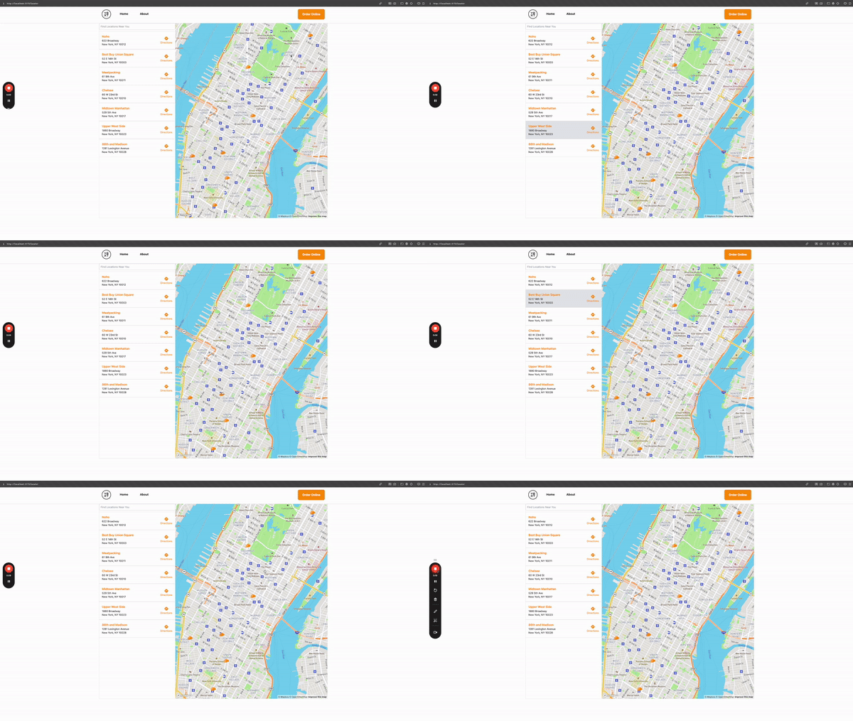
To implement pin-card interactivity, add React Context called MapContext to your locator with a setHoveredLocationId function. The custom MapPin sets the hovered location ID on mouseenter and clears it on mouseleave. If the hoveredLocationId matches the card's location ID, the card's background color changes.
One limitation: the PinComponent prop on MapboxMap does not have access to context values even when wrapped in a context provider. Pass hoveredLocationId and setHoveredLocationId directly as additional props:
<MapboxMap
  mapboxAccessToken={YEXT_PUBLIC_MAPBOX_API_KEY || ""}
  PinComponent={(props) => (
    <MapPin
      {...props}
      hoveredLocationId={hoveredLocationId}
      setHoveredLocationId={setHoveredLocationId}
    />
  )}
/>
Generic Map Provider (Map from @yext/pages-components)
This starter has pin/card interactivity configured using the generic map component.
The implementation uses a LocatorContext that stores the currently selected/hovered entities. In the CustomMarker for the map, user interactions with a pin update those statuses. The result list component checks for selected entities and uses that to scroll cards into view or apply styling changes.